

The Chart Center provides you with various chart types for displaying the price performance. Select the corresponding display from the "Chart type" drop-down list.
-
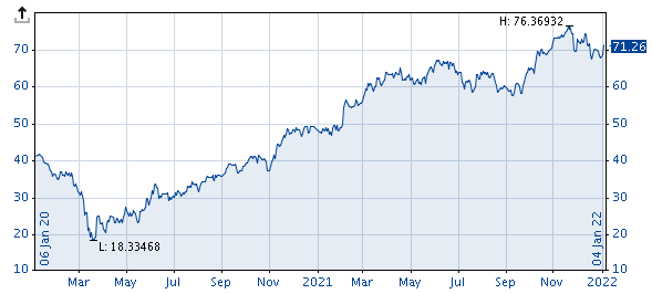
Area chart
-
Line chart (default setting)
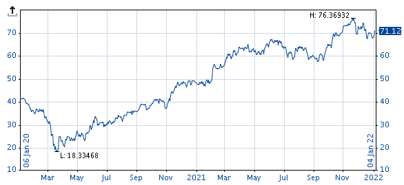
The line chart is the most common display form for price time series, and is usually set by default. The line for historical charts is continued every day, showing realised prices. Weekends and holidays are disregarded. For intraday charts, the available intraday rates are displayed accordingly.
-
Bar chart
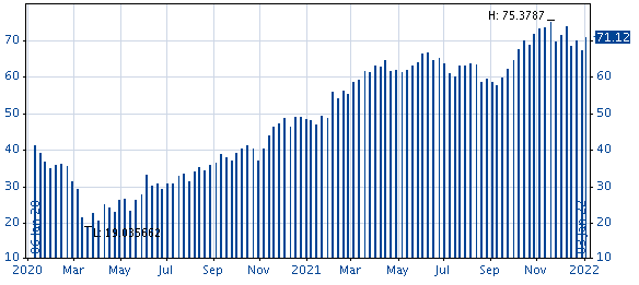
Histograms are the most common display form for volumes, but it is also used for some indicators. Here a bar is drawn up to the price's level.
-
Open, high, low, close
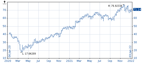
In Open/High/Low/Close charts (bar charts), the upper end of a vertical bar represents the highest price and the lower end shows the lowest price. The small horizontal line to the right is the closing price (Close), the left one corresponds to the opening price (Open).
-
Candlesticks
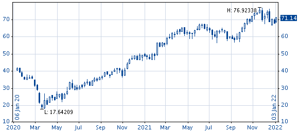
The candlestick charts are similar to the Open/High/Low/Close charts. Apart from the high, low, and close you can additionally see if the daily close is listed above or below the daily open. If the close is above the open, then the rectangle is shown in white (default setting); if it is below the open, then it is shown in blue.
If you have shown comparison values or benchmarks, these are always shown as line charts. For more information, see Show comparison values.